P3: Develop concept ideas and sequence for an animation to meet a client brief
Client Brief chosen: Scenario 1 - 'Progress Arts Weekend Festival'
Main points they want covered in the animation
- Promotional Animation
- Cover all the different art genres the festival has on display
- Themed character included
- Character available to be used again in leaflets and and handouts
- Want the animation to be an animated introduction for a mobile device app that will display as a full page. Or for it to be available on the web.
- Highly visible and engaging for a teenage audience
- Duration - 1 minute+
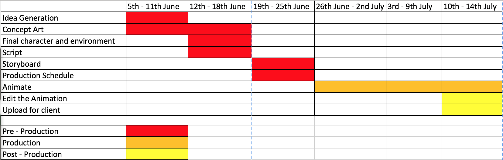
Concept Ideas
Idea 1
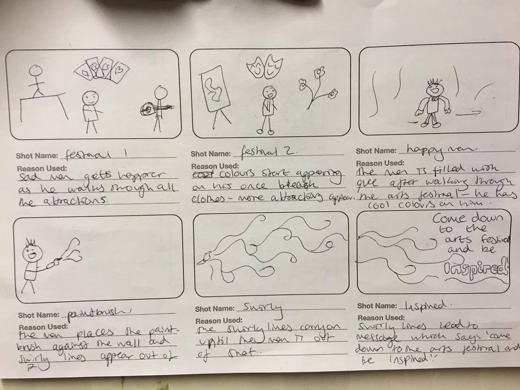
My first idea was to have a man who in some way becomes more inspired or a better person because of going to the arts festival. This would be shown visually by him starting off very sad and morose with only dreary colours surrounding him and then as he wanders through the festival and becomes elated with all thats around him. We then see him become more colourful in his clothes and the scene around him. This would fit the client brief because it promotes the festival by saying that coming to it would inspire you or make you become a better person. It also includes a themed character as the person going through the festival.
This would be fit to be engaging to a teenage audience because I will include many colours, cool transitions and effects to make the piece flow very well. The idea could be very good because the character has a storyline and a development throughout it which gives a really good edge and makes the animation have a clear beginning, middle and end as shown in the three split up blocks at the bottom of the page showing the basic outline of the animation.
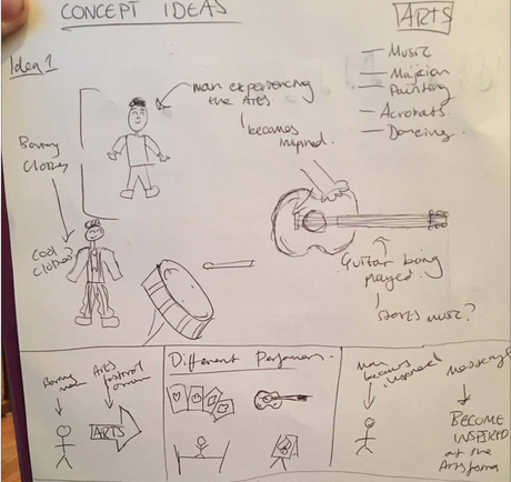
Idea 2
The second idea was to have one sole character who talks to the audience and takes them through the festival, this character would have quite a exciting and outrageous personality who would maybe crack a joke or two. This would fit the client brief because there is certainly a character who could then be used as promotion on leaflets and handouts as well as being engaging for teenage audience maybe more of the younger teens at least because the character is quite wacky and funny, but could again put teenagers off because they might feel that the character is too childish for them, so I will have to watch that if I go ahead with this idea.
As the character goes through the different things on offer, it's filling that client brief of showing the genres in the festival. This 'showing of the attractions' could backfire as it could get boring and monotonous however as long as there are different transitions and ways of showing things then it should be fine. Another potential problem with this character is there is no storyline or development to him so, again, the piece might falter.
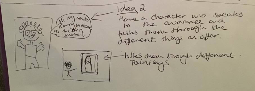
Idea 3
This next idea is quite weird and might be difficult to achieve and do justice for however, I thought that as a strong area of the arts festival is music, I could do a animation based around that. So I thought if a tune is played and the notes of the tune are along the bottom, as each note is pressed on what will probably be a piano, a different area of the arts festival is showcased above in very crazy animation style. The tune displayed above is just 'London Bridge is Falling Down' which is good because it is known however, I feel like if I pick this idea, I would choose something more fun and upbeat. This would fit the client brief because it's quite fun for the teenage audience however, again, could be seen as childish especially if I pick 'London Bridge is Falling Down' for the tune.
I feel like the notes would look really cool on an app, especially if you could drag the notes back with touch screen and replay the tune. It also doesn't include a themed character however, towards the bottom of the page you can see I had the idea of making the notes jump out and become characters, introducing the attraction above. I'm not sure really how the note characters could go but I like the idea.
Idea 4
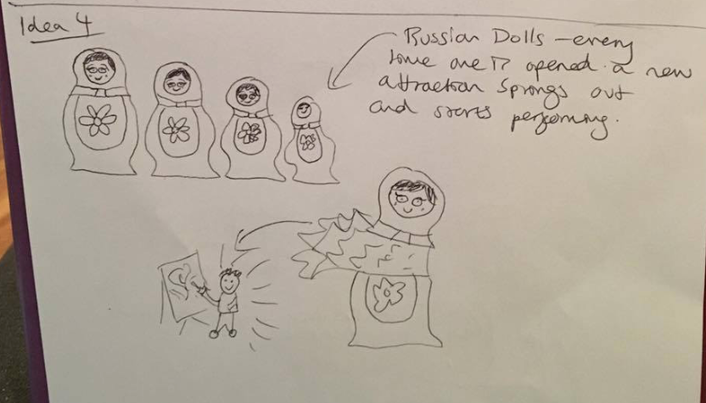
My last idea is a fun one where it starts off with a single Russian doll and as it is opened, a different attraction from the festival appears and start moving as well as another Russian doll popping out. We then see the next one opened with another attraction jumping out and so on. I really like this idea because it's quite fun and colourful however, I feel it misses the mark on too many client brief points the main one being a themed character which isn't present in this idea but, I did think that having the Russian dolls could become something quite cool with all the leaftets and handouts. You could make different Russian dolls for each genre of the arts with that chosen art on the middle of the doll and then have separate leaflets for each genre or introduce each genre with their chosen doll, it could be quite fun.
However, I feel like for the animation, it could get quite monotonous and dreary just watching the dolls open.
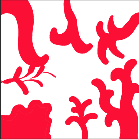
Colours
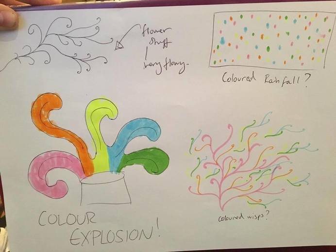
This isn't an idea, I just did some concept art around the sort of colour movement I want to bring to the animation because I feel like if there's one thing that will draw people in and make the animation exciting, it's the colours. I really like the idea of the explosion with the colours going everywhere and filling up the screen as well as the coloured wisps I called it because I could animate the wisps emerging and adding on more curls which would give a real cool effect.
Final Story Concept
I have decide to go with my first idea because I think that it is the most plausible and better for the brief I was given. There is also a lot of opportunity and breathable space with this idea because I could really take the transitions from one part to another in any directions - I will most definitely be using lots of colour to do them and, of course, engage the audience.
This idea is suitable for the clients target audience of teenagers because
- There will be lots of colour which is very engaging and fun for all ages
- The way I will be transitioning from one thing to another is something I will work hard on with maybe having spats of colours on the screens to change backgrounds.
- The style will be very 'hand drawn' looking and a bit messy which, I feel, will look very cool and rustic.
- The character will have real development and a story to go on through the festival.
- The animation will also not be very long so the audience won't get bored, this is suitable for the target audience of teenagers because they are known to have the worst attention spans.
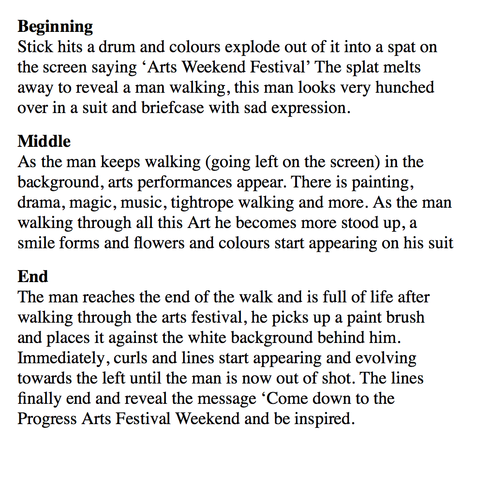
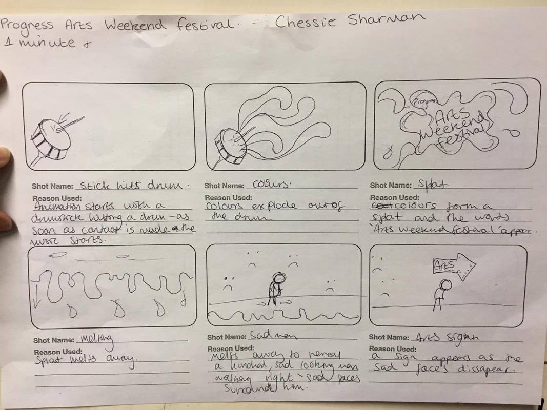
This is the first draft of the outline of the story from the beginning to middle to end, I know it isn't very extensive but this is just a basic outline and I feel, if overcomplicated, there is no room for minor changes throughout production that could improve the overall animation.
Sound: The sound in the animation I thought could be quite for the start and then a drum sound when the stick hits the drum floored by a little tune to go in the background of the walking maybe the tune starting off quite slow because he's sad and then developing into something kore and then fizzing out right at the end when the message at the and appears. There could also be background noise of people laughing and talking as if at the festival and as well as that, different music sound very faint so it doesn't overkill the main tune but still there just to give that festival feel.
Character Concepts
|
|
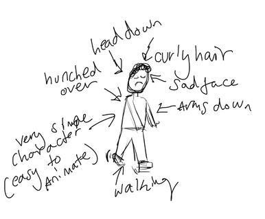
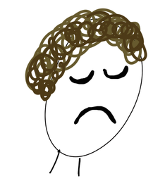
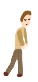
My character is very sad and morose and this is reflected through his clothing which is made up or all browns. His stature is also very slumped and hunched over, further conveying his and emotion, his hair is brown and curly. The actual drawing is very simple because this makes it easier to animate.
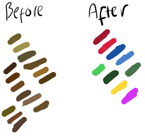
Here I put some of the colours I liked for the before stage of my character when he was very sad and the dark browns and off greens reflect that to then go to very bright happy vibrant colours.
Type of animation: I'm going to be making a 2D Animation on the computer using a software called 'Animation Desk' I chose this type of animation because I always prefer computer generated animation as it is much more slicker and, to me, flows better. I also feel like it is more ergonomic because I carry my computer wherever I go so I can be animating anywhere. Where as, if I were to do claymation, I would have to have a set up with lighting and a set and that's the only place where I could work on it.
I chose the software 'Animation Desk' to do it on because I really like the simplicity of the program and with a drawing pad, the actual creating of the characters and backgrounds should be fairly easy. There is also options of duplicating your frame or certain parts of the frame which allows for easy animating and development in production.
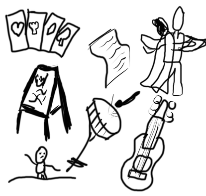
Environmental Concepts
My video doesn't have a defined background that is there throughout, however there are key parts of the animation with different props in the background that are important to the plot and should be plan out before I choose the final look of them.
|
|
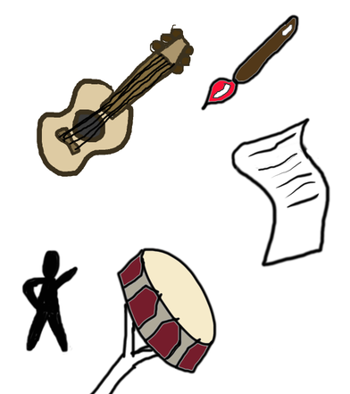
This is the concept art for the pieces which make up the environment, so the arts festival the character is walking past. The sketches on the left are initial ideas and the ones on the right are more or less the finished idea with colour.
A lot of the animation includes spirals and splotches intertwining and animating in cool ways so I wanted to practice and see what sort of thing I wanted it to look like. |
I found the dancing man one of the hardest to draw and animate so I did some ideas of possible poses he could be in. |
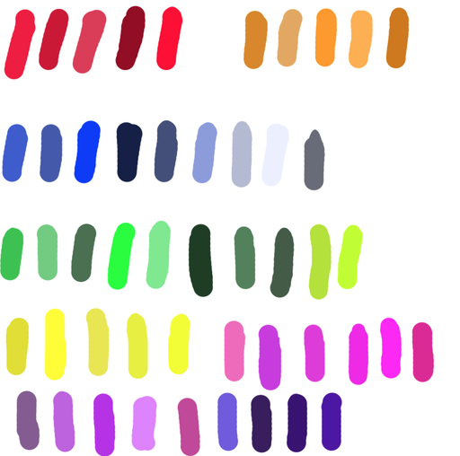
Colour is a huge part of the environment in the animation and I wanted to see which shades I liked together and what would make up the spirals best.
Running Time
The client brief states that the video has to be 1 minute+ and I think that I will stick to just one minute because I already think thats quite long for an opener to an app or even on the web. I think 1 minute is a good starter and then if the Progress Arts people feel that it is too long there will always be ways to create a shorter version. The time will give me the opportunity to really showcase each genre very well and thoroughly.
Clearly identified target audience
The animation will appeal to the target audience teenagers because it's very fun and fast-moving with lots of colour and that handrawn, messy look that will make the animation look very independent and special which will engage the audience and make them want to come because it is promoting something very special and independent. The character will also be very fun to look at and experience the story with because, I could add in little quirks and prices of personality like a shrug of shoulders when he sees the sign for the festival. This will make the audience engage with him further because they will see him as more 'human.' The story could also relate to some teenagers because he's trying something new which is something many teenagers go through and maybe have worries about. However, upon seeing how elated and inspired the character is at the end might spur them to find something new to do themselves.
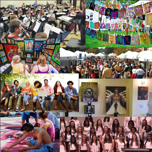
In the moodpboard I focused on teenagers who perhaps already had a bit of a arts background because that is who I believe is most likely to come to the festival. These would be people who took part in school choirs and bands as well as maybe people who painted and enjoy the arts overall so that includes drama people.
P4: Create a Pre-Production Plan for the animation
Script
Progress Arts Festival Promo by Netherhall MediaStudies on Scribd
Risk Assessment
RA- Chessie Sharman - UNIT 10 by Netherhall MediaStudies on Scribd
Production Schedule
I don't see fit to organise a production schedule because I have no voiceovers in my animation, the sound is coming from royalty free tracks and sounds online, and all the resources I need are
- My MacBook pro
- Installation of the program 'Animation Desk'
- A HUION H420 4" x 2.23" USB Art Design Graphics Drawing Tablet Board with Digital Pen
However, I did feel it necessary to work to industry level standard and so I have produced a GANTT Chart in the 'consider' section below which tells me the timings of when things should be done.
Detailed Final Character & Environment Drawings
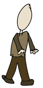
This is my finished drawing on the program of my character, as I said it has that 'hand-drawn' feel with very bland colours and a simple but sad face. All these elements make him easier to animate because, there is that 'messiness' in the hand-drawn look as well as having a very simple body shape so to make him walk there really isn't much to do.
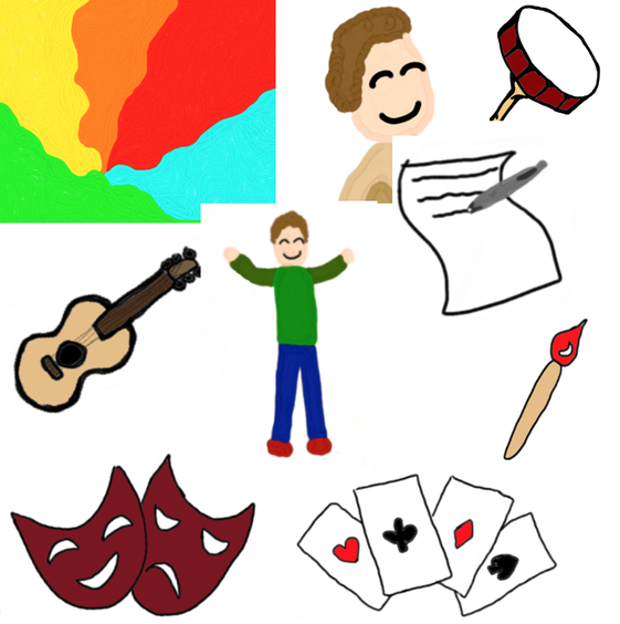
These are all the other finished elements of the animation, you can see the chosen colours in the spiral bit and all the arts festival additions. As well as my finished character in the middle with brighter clothing and a smilier face, this is of course after he's been to the arts festival and is much more happier and excited.
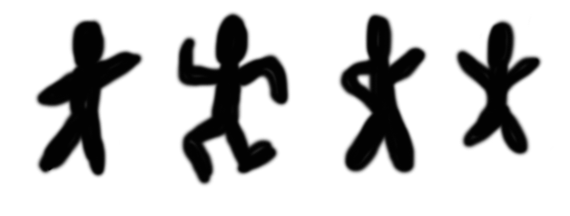
Animation Tests
This is an animation test of a man running, I wanted to make sure that I could do that area of animation well and make it actually look like he was going from one place to another. This effect is made by having things in the background middle layer moving past him, this gives the effect of the stickman actually getting somewhere. Because a good bulk of my animation is a man running, I wanted to make sure I could do it.
I did this test to see if I could do the swirly things and to try out the duplicate frame feature and stamp tool on animation desk. This was to make sure I could use and apply them effectively before I settled on animation desk as the program I want to make the video on.
These actual frames did make it into my final video also this video I put at 12 fps which is what I intended my whole animation to be at however I thought because this was so static that I should make it higher. I really just started doing these frames as a little test to see if I could make the swirl happen and they made it into the final thing.
This test was to try to make my character walk for the first time and it looks okay but jolts every two seconds or so because it doesn't quite match up. Also, to make it look more realistic I realised I had to make the sad faces in the background move along as he was walking past them.
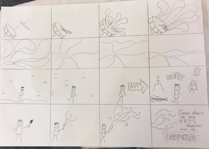
Storyboard Sequence
Consider